Starbucks
One of the most exciting and stretching seasons of my career. This was my first brush working in an organization so large and complex. I learned how to get things done while coordinating several departments to enable our team’s best work. While managing a large team I continued to contribute design to iOS, as well as being the primary point of contact for leadership. There were many many projects during this time, but I'll include the most interesting and challenging ones here.
Scroll to See Projects
Jump to:
↓ Roles
↓ Responsibilities
↓ Reports
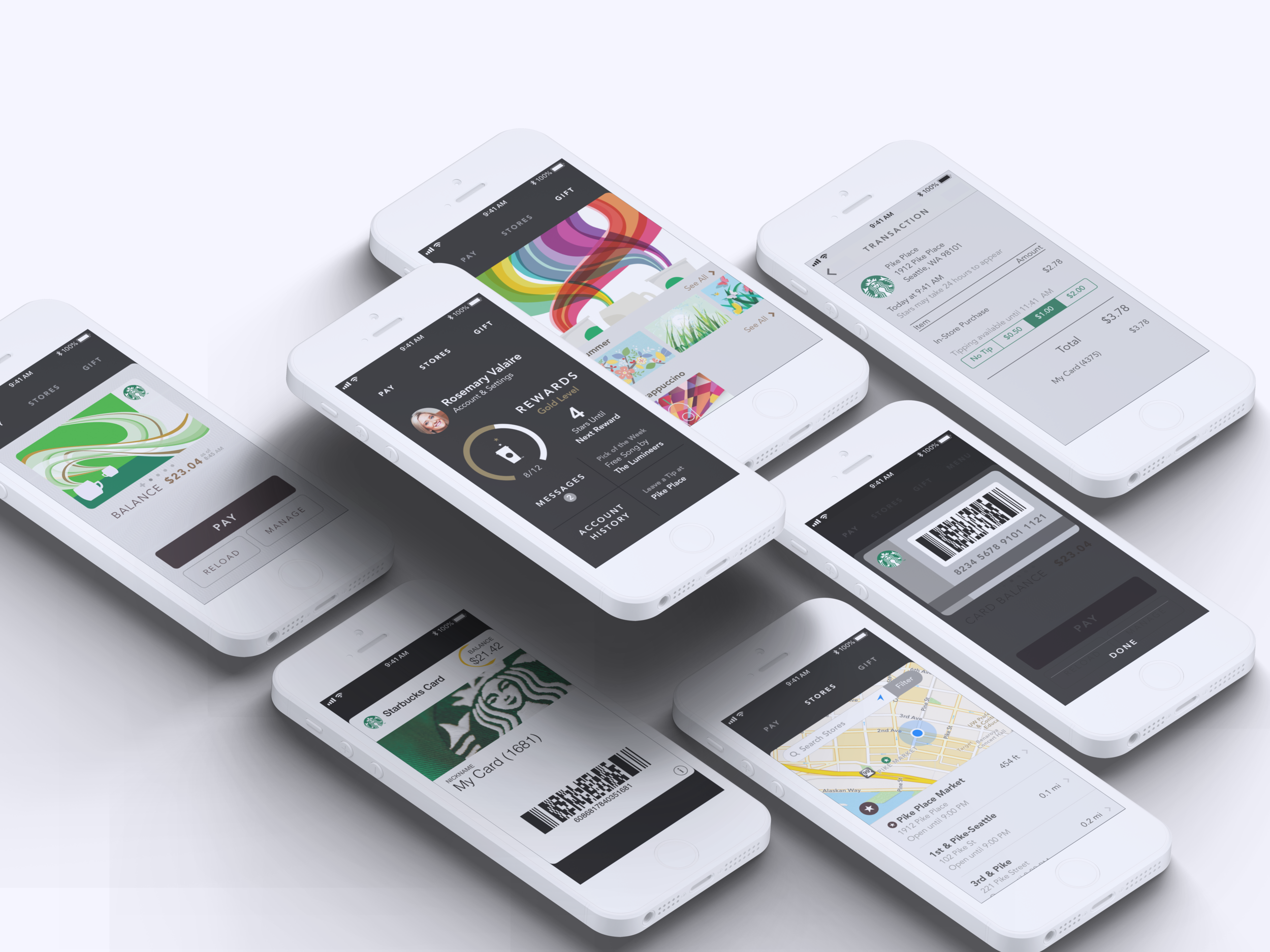
Starbucks 3.0 Redesign
Though the redesign wasn’t our first project, it was the primary reason we were hired. This effort was not simply a re-skinning of the existing app, but a ground up rewrite.
The aesthetic for this redesign was inspired by the more premium elements of Starbucks’ brand. We took inspiration from the reserve brand, packaging, and store design to focus more on earth and coffee tones rather than leaning too heavily on the green and white that was historically used.
The work we did here had a cascading effect across the rest of Starbucks’ digital brand, and firmly established our team as the internal brand authority for all digital properties.
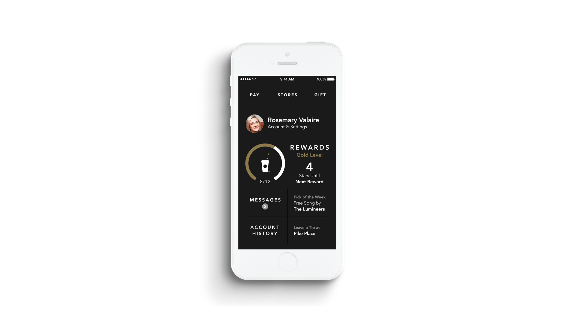
Video Walkthrough
This video was originally composed for the annual shareholders meeting where Adam Brotman unveiled the new experience for the first time.
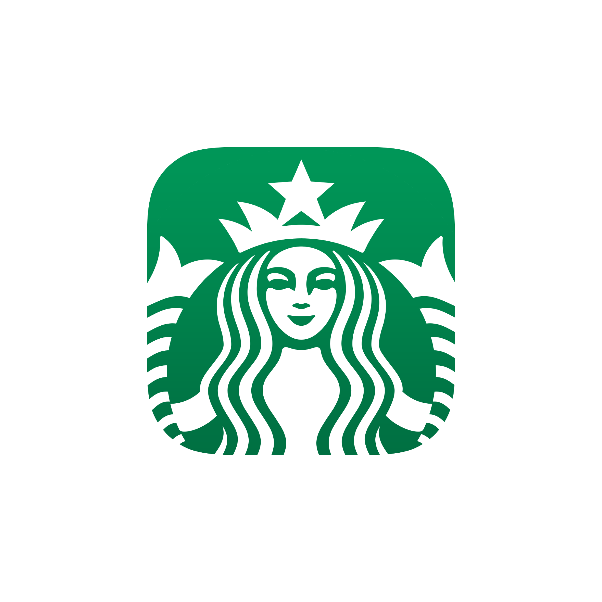
App Icon
Redesigning the app icon was an incredible opportunity. I was inspired by a rebound Jason Stoff made on dribbble of Louie Mantia’s. After launch, I publicly gave him credit for the idea and made him a job offer- which he accepted. As of this writing he still works at Starbucks today.
Mobile Order & Pay
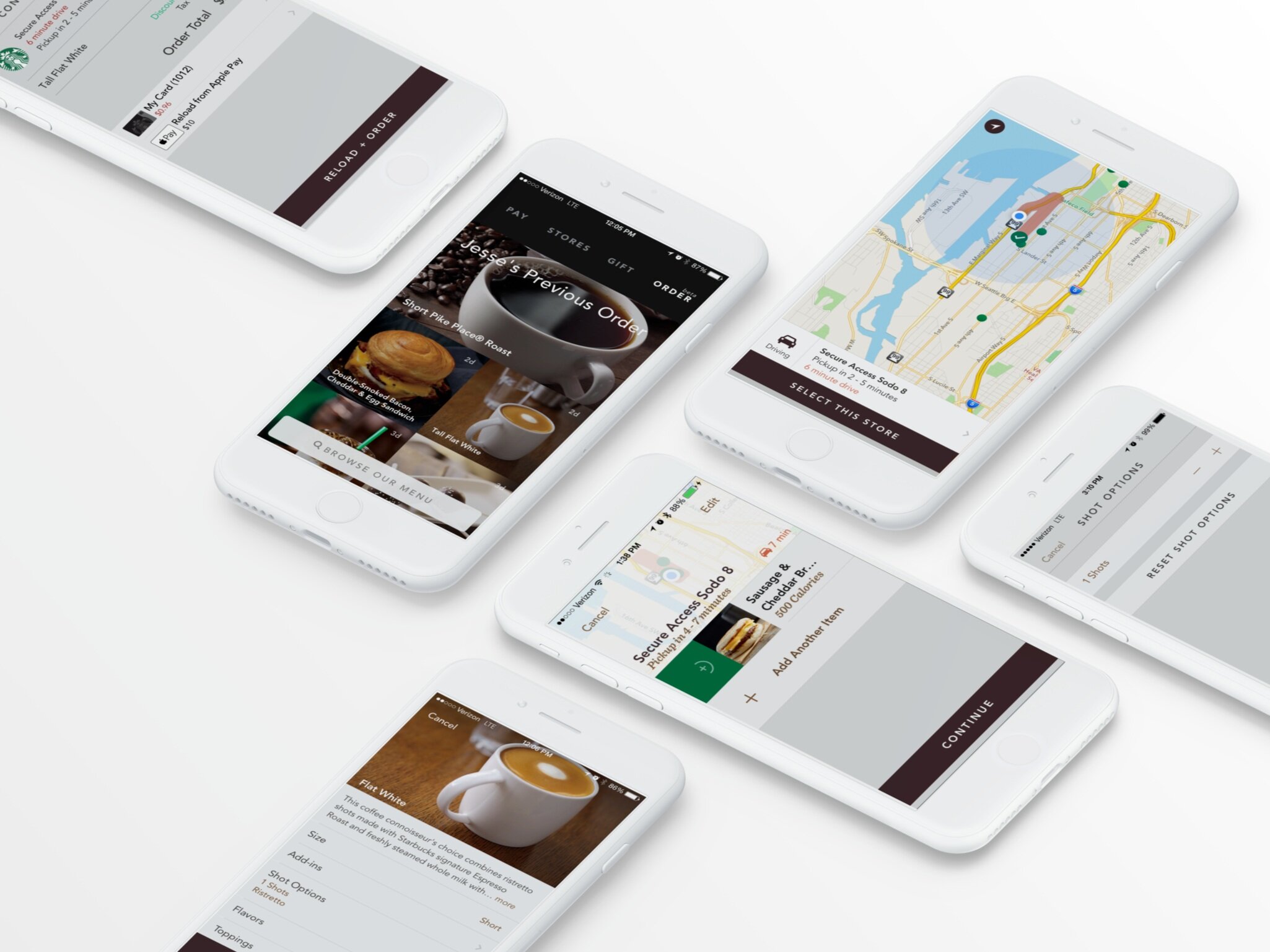
This was easily the most challenging and exciting projects of my career so far. Ordering drinks from your phone seems so natural today, at the end of 2018 12% of all purchases made at Starbucks were mobile orders. At the time however, nobody was operating mobile orders at the scale that we needed to. Every single Starbucks Barista in the United States had to be trained on how to handle mobile orders, and every store needed to be reconfigured as well- it was no small undertaking. Every week we would meet with the heads of nearly every department in Starbucks and present our work. The key challenge was creating an experience got timing just right, so that your food and drink were fresh and ready right when you arrived at the store- no small undertaking. We built out prototypes, tested them with real customers extensively, and even orchestrated a soft rollout to the Portland market to test everything before going nation-wide.
Apple Watch 1.0
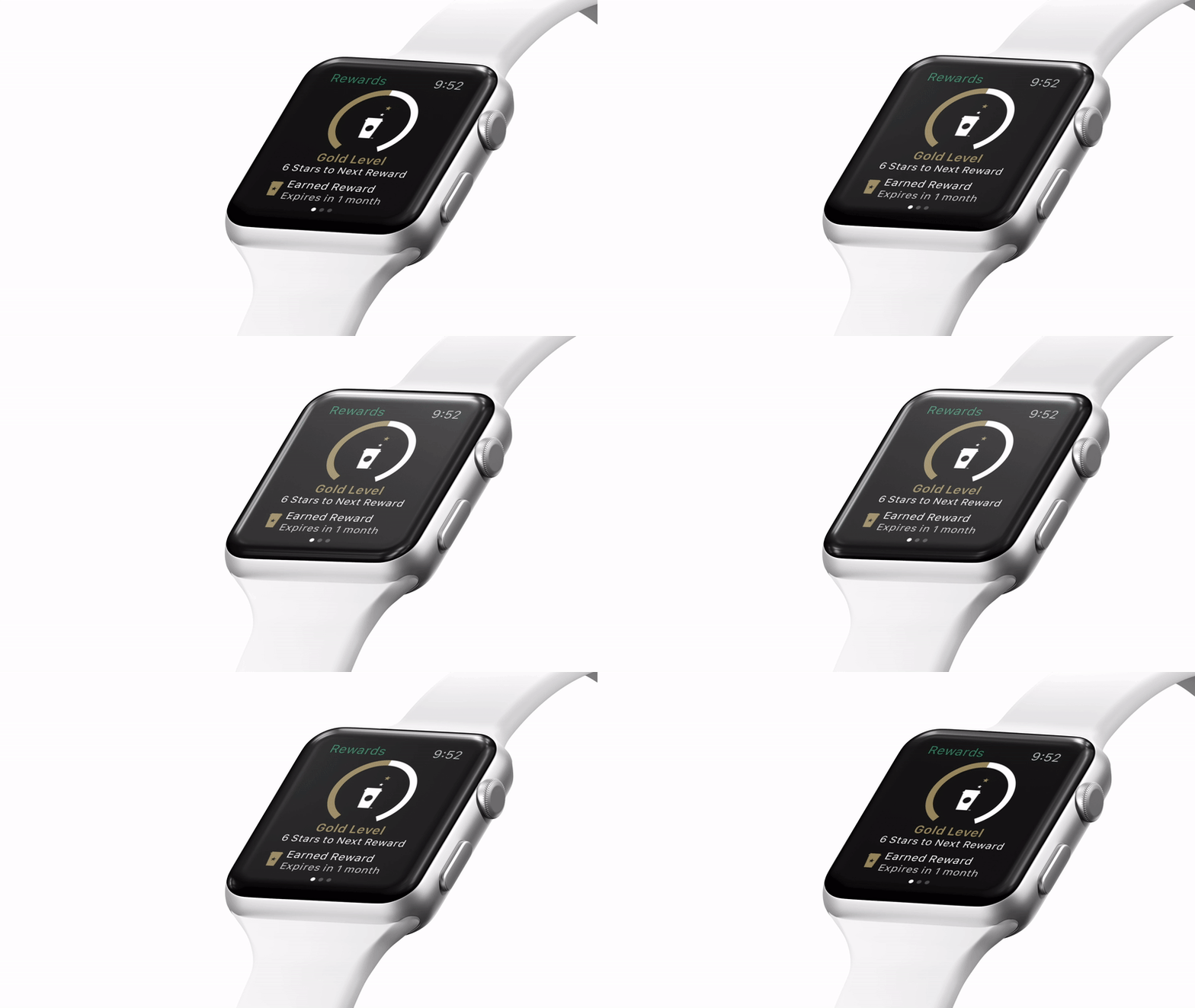
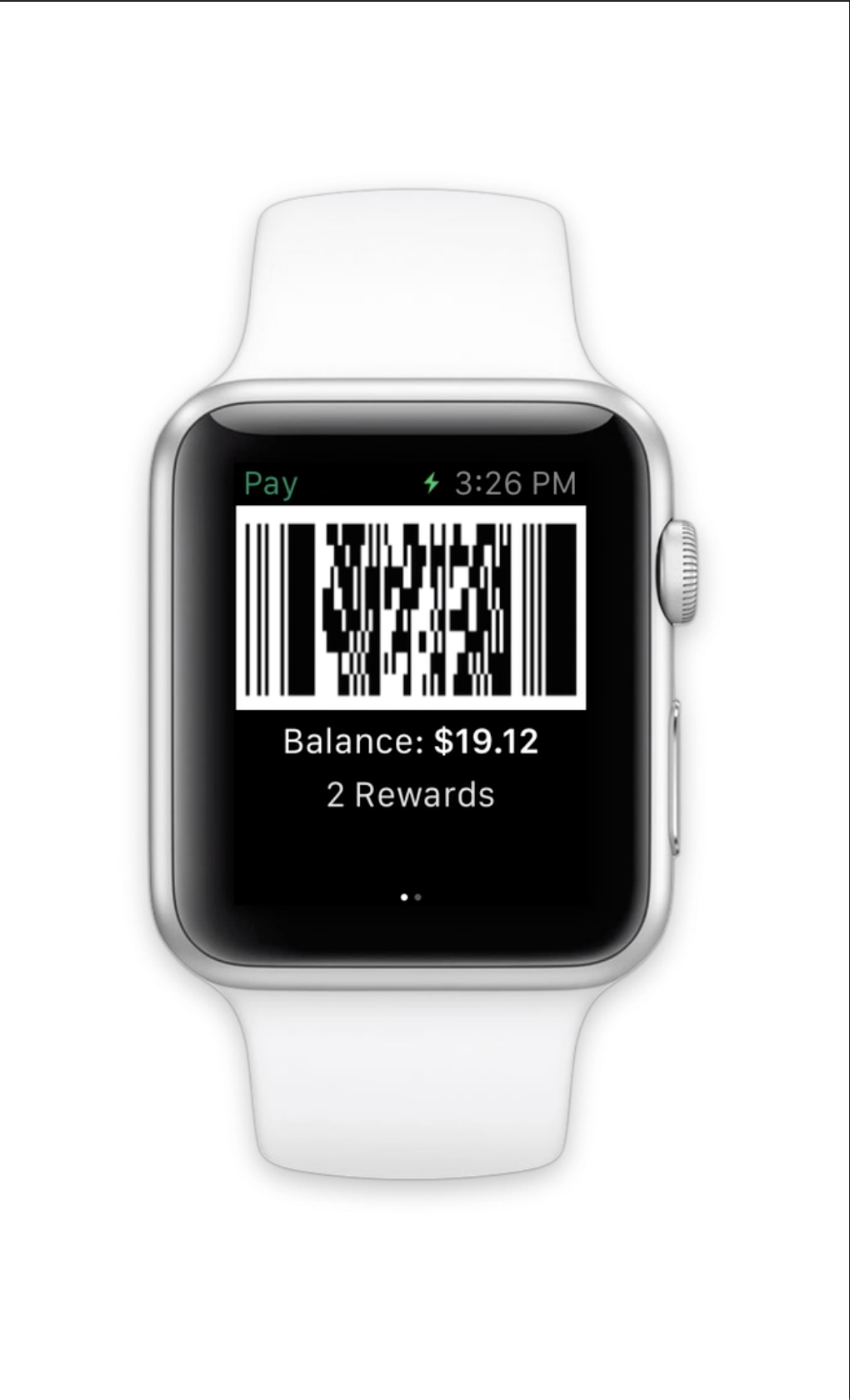
One of my most favorite things about working for a giant mega-corporation was getting invites to Apple to build stuff for unreleased products. Most of my work here was creative direction and a bit of graphic design at the end, while Bryan Clark did the majority of the heavy lifting.
Roles
Hired Role: iOS Design Contractor
Final Role: Head of Digital Product Design
Scope of Responsibility
Manage Mobile and Web Design Team
Advise Global Starbucks Design Organizations
Liason with Starbucks Creative Studio & Marketing
Present work to executive leadership
Design for iOS App
Collaborate with iOS engineering team as well as third party vendors
Oversee other various internal application design efforts
Reports
These are the heroes I worked with at Starbucks, each one was hand picked by myself to build a critical part of the team.